
Out of Office Club is a membership-based lifestyle brand that repositions rest as a cultural status symbol. It pushes back against hustle culture by reframing boundaries, disconnection, and intentional unavailability as markers of success rather than laziness. The identity blends wellness, exclusivity, and culture for founders, creatives, and professionals who treat time and attention as their most valuable assets.


Moodboards
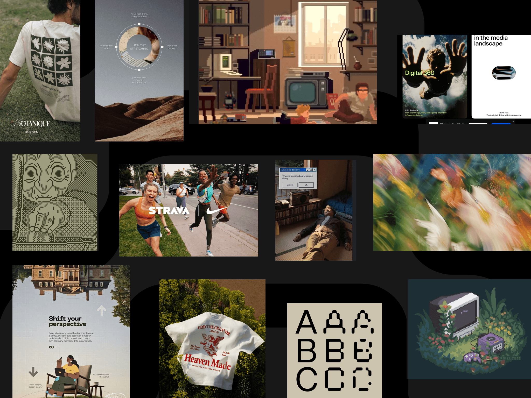
Photography leans into anonymity and stillness exploring figures that are unhurried, often solitary, shot in ways that make you slow down just looking at them. Close crops, soft natural light, and desaturated tones keep the imagery tactile and present rather than aspirational or performative. The pixelated graphic language sits alongside this photography as a quiet visual metaphor of a person choosing to become unreachable. The vibes of signal dissolving, a status going offline. Together they build a world that feels editorial and considered, making stepping away elegant instead of something to question.`
Tonality and Direction
Out of Office Club speaks in a tone that is calm, assured, and quietly radical. Refusing to participate in the hustle culture. The visual and verbal language borrows from retro-digital aesthetics, pixel art, and ASCII sensibilities and adds a softer touch to it to cater to the young exhausted audience and add modernity to the retro style. It treats rest as something already deserved, not something to be earned.
The brand expresses this through quarterly retreat drops, design-led physical objects, and digital boundary tools built around the idea that rest is a deliberate practice. Visually, it leans into a soft pixelated identity that nods to a slower, more playful era of digital life, using that aesthetic to symbolize going offline gracefully. The core proposition: unavailable is the new successful.


Back to works
Out of Office Club is a membership-based lifestyle brand that repositions rest as a cultural status symbol. It pushes back against hustle culture by reframing boundaries, disconnection, and intentional unavailability as markers of success rather than laziness. The identity blends wellness, exclusivity, and culture for founders, creatives, and professionals who treat time and attention as their most valuable assets.
Moodboards
Photography leans into anonymity and stillness exploring figures that are unhurried, often solitary, shot in ways that make you slow down just looking at them. Close crops, soft natural light, and desaturated tones keep the imagery tactile and present rather than aspirational or performative. The pixelated graphic language sits alongside this photography as a quiet visual metaphor of a person choosing to become unreachable. The vibes of signal dissolving, a status going offline. Together they build a world that feels editorial and considered, making stepping away elegant instead of something to question.`
Tonality and Direction
Out of Office Club speaks in a tone that is calm, assured, and quietly radical. Refusing to participate in the hustle culture. The visual and verbal language borrows from retro-digital aesthetics, pixel art, and ASCII sensibilities and adds a softer touch to it to cater to the young exhausted audience and add modernity to the retro style. It treats rest as something already deserved, not something to be earned.
The brand expresses this through quarterly retreat drops, design-led physical objects, and digital boundary tools built around the idea that rest is a deliberate practice. Visually, it leans into a soft pixelated identity that nods to a slower, more playful era of digital life, using that aesthetic to symbolize going offline gracefully. The core proposition: unavailable is the new successful.