Built To Differ
Built To Differ
Awareness Campaign for TISDC | Celebrating Diversity
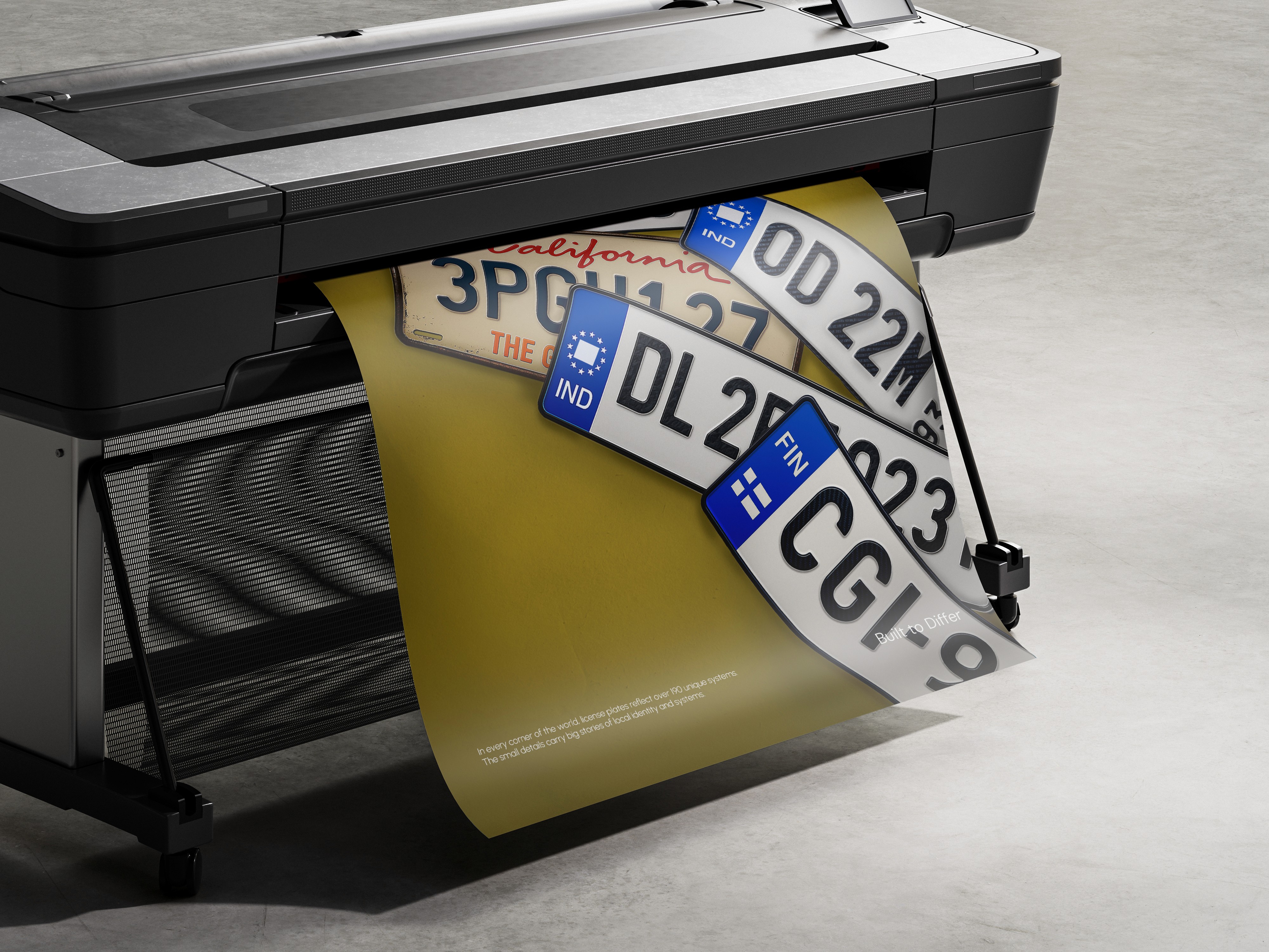
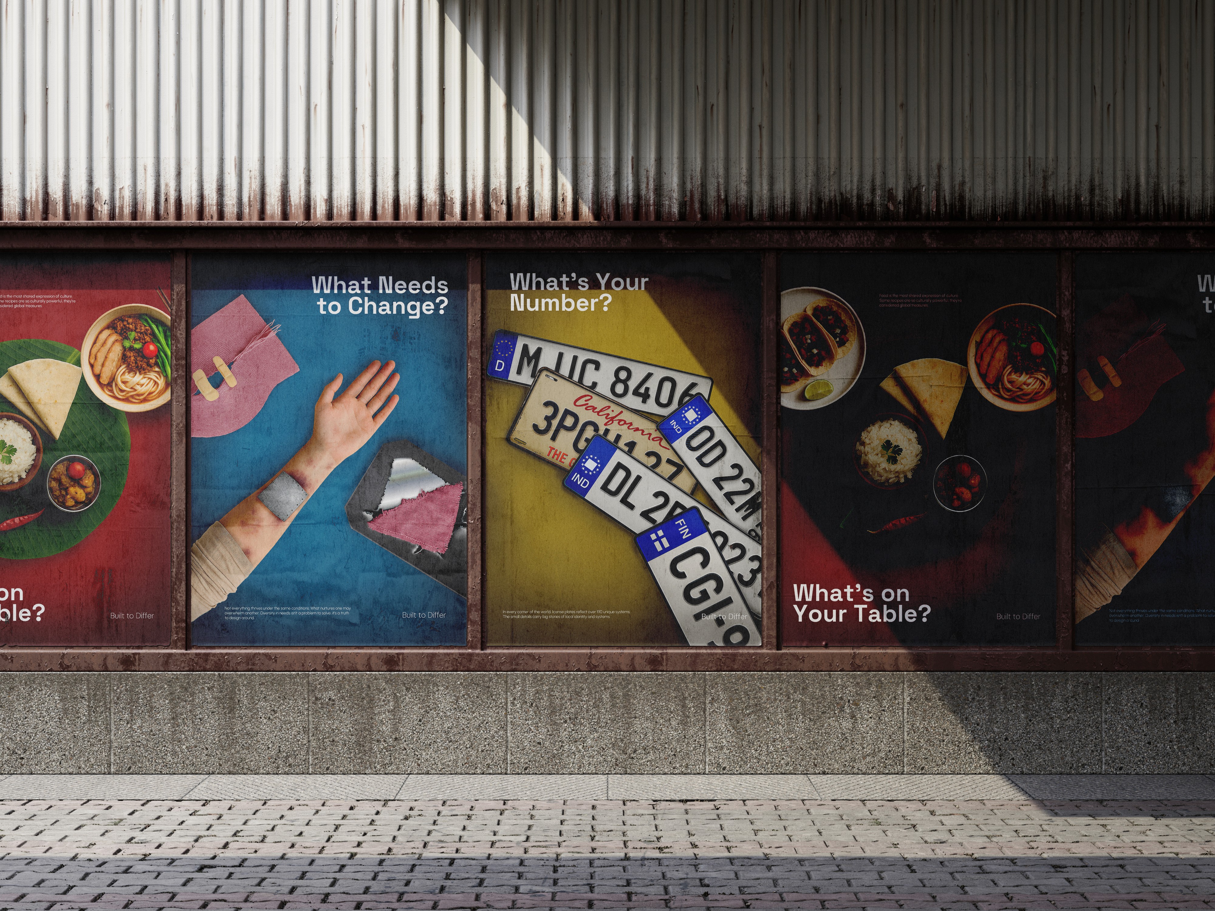
This is a Out of Home Awareness Campaign concept made for TISDC : Celebrating Diversity
Diversity is about respecting and embracing differences, integrating diverse cultures, fostering innovation, promoting collaboration, and creating an inclusive society built on mutual support.
AIM
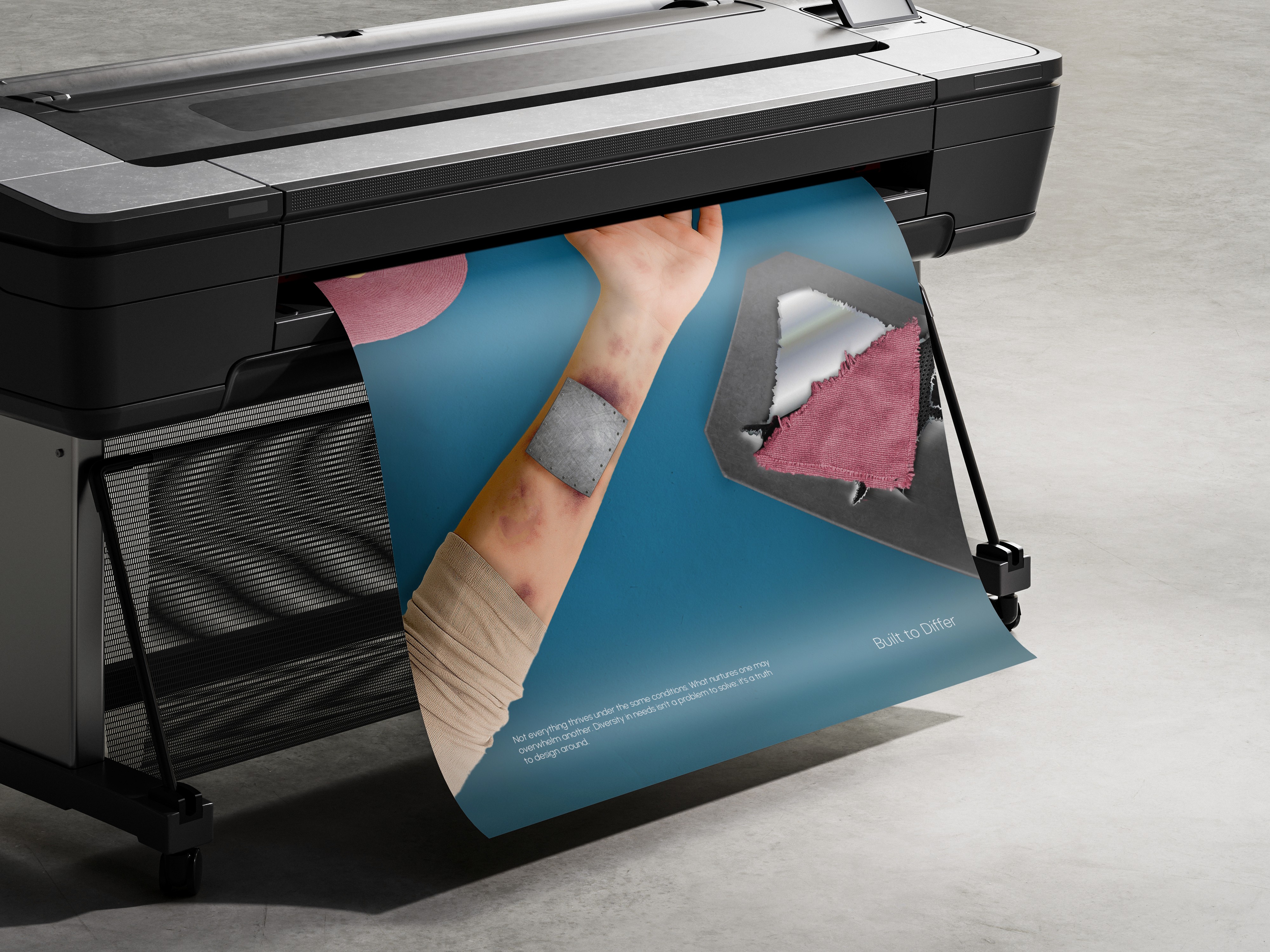
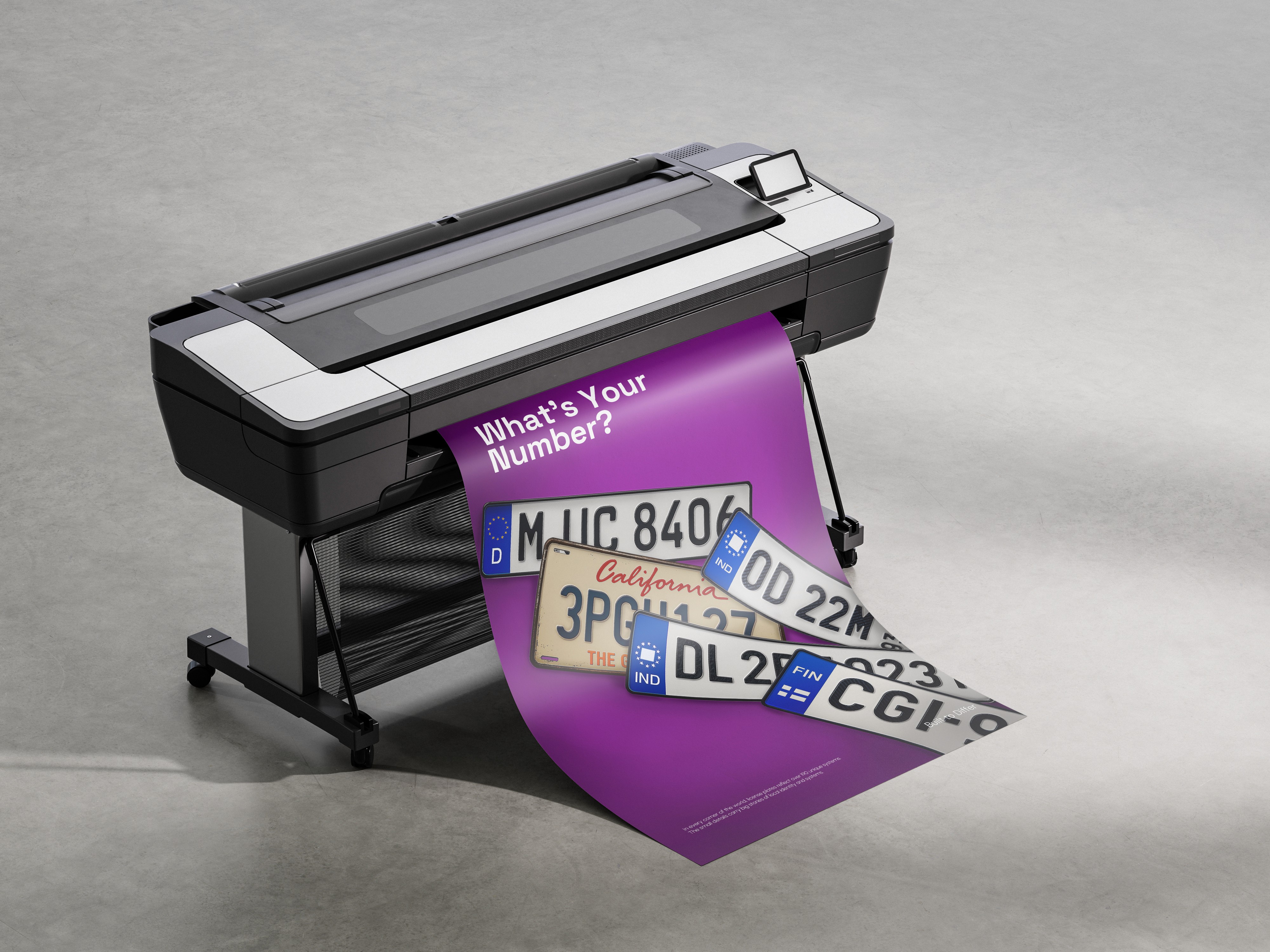
This Visual Design Project Includes a 3 poster campaign that aims to shed lights on the factors that silently speak diversity in the nature of things that usually end up being overlooked. The goal is to engage the audience make them reflect, aware of differences by asking them questions and eventually make them answer themselves ; communicating inclusivity in ways it has barely if not at all done before.
Challenge
Every time there is diversity or difference mentioned or promoted they are all very surface level. Flooded with ideas like skin color foot or fingerprints or languages.
So I challenged myself to not touch any of the cues that are being repeatedly used in media and go deeper to create an idea that resonates better with the target audience.


For this work, I decided to pick three categories :
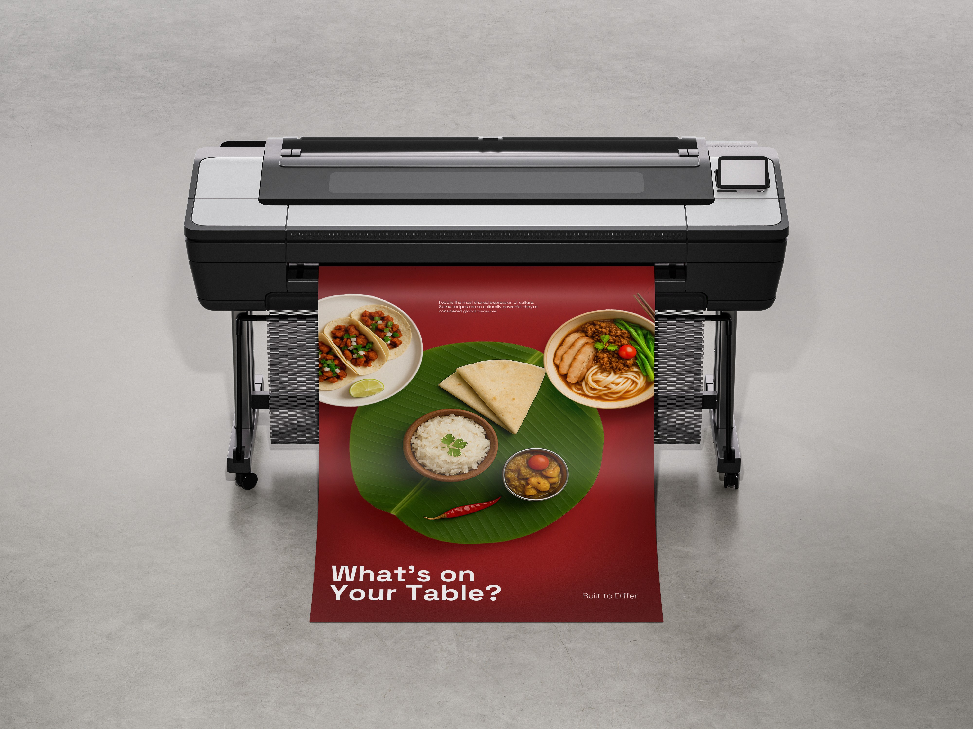
Cultural Diversity
Geographical Diversity
Diversity in Needs
The ideas were further divided in three parts of the poster; each playing their role and setting a balanced hierarchy. These included a visual hook which was the primary component of the composition, complimented by a question which was consistent in its tonality throughout the 3 posters; setting a cohesiveness in the ideas. The third and final element was the context and information that eventually ties up everything together and subtly gives the answers to the questions that would be triggered in the audience's mind.
Putting it in as the least "loud" in the hierarchy of the design was intentional to add balance in the composition and create a time gap between the hooks and the answer in contrary to putting the ideas straight up without making them interestingly presented that ends up reducing the overall memorability of the message.


The campaign eventually celebrates all the differences there are ; promoting inclusivity that everything by nature is not supposed to be seen ,treated or consumed in the same way as they are uniquely made in a certain way.
Just as this campaign they are;
Built to Differ.
[thanks for reading the whole thing :)]
Back to works
Built To Differ
Awareness Campaign for TISDC | Celebrating Diversity
This is a Out of Home Awareness Campaign concept made for TISDC : Celebrating Diversity
Diversity is about respecting and embracing differences, integrating diverse cultures, fostering innovation, promoting collaboration, and creating an inclusive society built on mutual support.
AIM
This Visual Design Project Includes a 3 poster campaign that aims to shed lights on the factors that silently speak diversity in the nature of things that usually end up being overlooked. The goal is to engage the audience make them reflect, aware of differences by asking them questions and eventually make them answer themselves ; communicating inclusivity in ways it has barely if not at all done before.
Challenge
Every time there is diversity or difference mentioned or promoted they are all very surface level. Flooded with ideas like skin color foot or fingerprints or languages.
So I challenged myself to not touch any of the cues that are being repeatedly used in media and go deeper to create an idea that resonates better with the target audience.
For this work, I decided to pick three categories :
Cultural Diversity
Geographical Diversity
Diversity in Needs
The ideas were further divided in three parts of the poster; each playing their role and setting a balanced hierarchy. These included a visual hook which was the primary component of the composition, complimented by a question which was consistent in its tonality throughout the 3 posters; setting a cohesiveness in the ideas. The third and final element was the context and information that eventually ties up everything together and subtly gives the answers to the questions that would be triggered in the audience's mind.
Putting it in as the least "loud" in the hierarchy of the design was intentional to add balance in the composition and create a time gap between the hooks and the answer in contrary to putting the ideas straight up without making them interestingly presented that ends up reducing the overall memorability of the message.
The campaign eventually celebrates all the differences there are ; promoting inclusivity that everything by nature is not supposed to be seen ,treated or consumed in the same way as they are uniquely made in a certain way.
Just as this campaign they are;
Built to Differ.
[thanks for reading the whole thing :)]